The Survey Results Are In, Now What?
We all love surveys. From real-time polling on Instagram Stories to participating in an in-depth research study, everyone wants to have their voice counted and to see how they stack up against their peers. In the IT channel and tech industry, it seems like we can’t get enough of them. But nobody runs a survey just for a sake of it, it’s the results and what we do with them that we are after.
Results Are Good, Findings Are Great
Let’s say you wanted to learn more about your customers or partners thoughts on a technology trend or new offering you want to take to market. You run your survey, get a great response rate, and start drooling over the results. Your next step is probably going to be putting sharp looking charts into a PowerPoint presentation and sharing them during your next team call.
From there, you might spiff up a few highlights from the survey and present it on your next external webinar. Chances are it might look something like this.
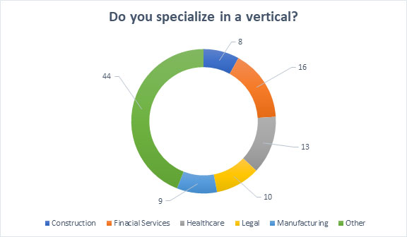
As a marketer, you’ve accurately presented your results, but that’s about it. Results like this are:
- Accurate? Yes
- Engaging? No
- Informative? Sort of
- Establishes your point of view or domain expertise? No
- Worthy of a social share? No
- Usable in a marketing campaign? Maybe
- Worthy of a lead-generation form submission? No
If Not This, Then What?
If we all agree that presenting your survey results like we just showed are not the best approach, then what can you do? We recommend turning those results – and more importantly – your analysis and point of view, into an external facing piece of thought leadership content. This could be an infographic, an email nurture campaign, a whitepaper, a series of digital ads, and more.
Merit Mile recently did just that with Citrix using the results of their annual Citrix Service Provider partner survey. In full transparency, we too started with a set of boring “results” slides like the one above. But from there we:
- Applied our own findings and studied year-over-year trends
- Wove it all together into an orderly story
- Brought it to life with engaging creative
What came out of this was the Citrix Workspace Services Global Market Trends for 2019: The Service Provider Perspective.
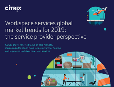
Inside, readers find a deep narrative that does more than just present the results. It explains what they mean to the reader and gives them actional insights.
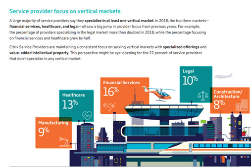
Now let’s compare how a piece of thought leadership content based on that very same survey data compares to the first example.
- Accurate? Yes
- Engaging? Yes
- Informative? Yes
- Establishes your point of view or domain expertise? Yes
- Worthy of a social share? Yes
- Usable in a marketing campaign? Yes
- Worthy of a lead-generation form submission? Yes
- Establishes your point of view or domain expertise? Yes
- Usable in a marketing campaign? Yes
- Worthy of a lead-generation form submission? Yes
Shout it From the Rooftops!
The last thing to consider is how to get your amazing, eye-popping, and engaging findings into the hands of your audience. No need to reinvent the wheel here, as this is calls for classic in-bound and out-bound marketing. Social media, sponsored content, earned media, blogs, webinar, emails – all the usual suspects will work here. What’s important is ensuring you have a measurable plan for demand-generation and tracking performance. Don’t just hope your audience picks it up.
Need Some Help?/
By now you might be saying, this all sounds great, but I have neither the time or creative team to pull this off. Merit Mile can help. Whether it’s running a survey, authoring a report, designing an infographic or everything in between, we’re here to help.
Good luck and happy marketing.
Learn more at https://www.meritmile.com/technology-marketing